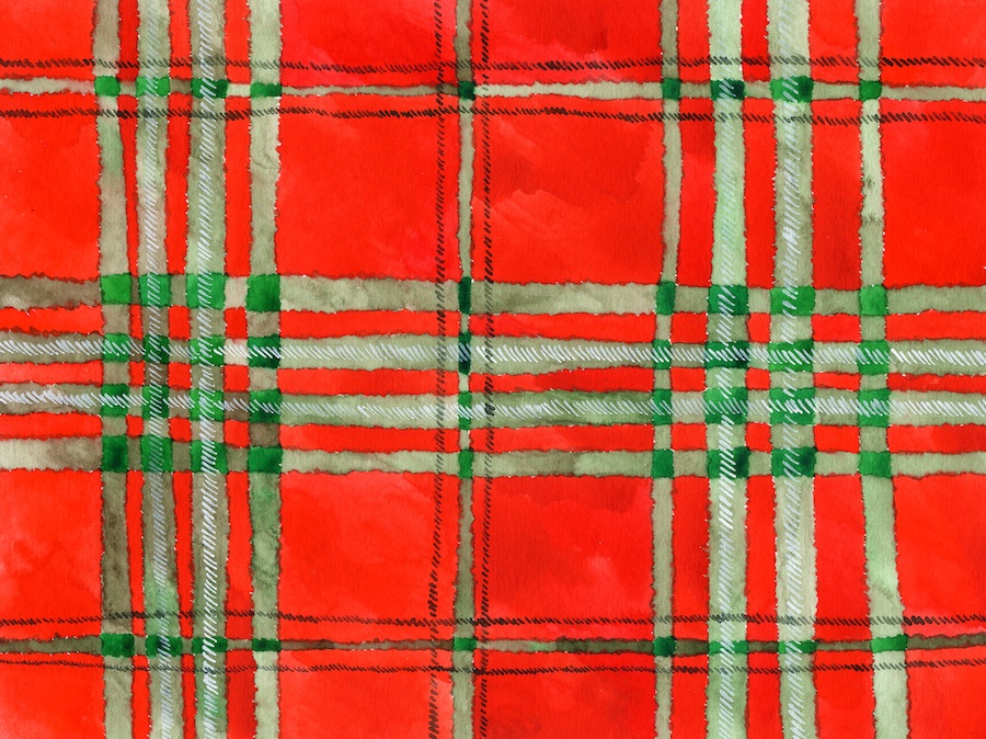
Monday

NY Times Best Illustrated Childen's Books

© Shaun Tan, from "Tales from Outer Suburbia"
and I sincerely hope he doesn't mind my showing this here

Its always interesting to see what they pick and to read why.
They also publish a more comprehensive list.

Amazing, the range of art styles and talent, writing styles, types of stories, themes, etc. etc. Lots of creativity going on here! And lots of inspiration if you're a fellow children's book illustrator.

~~~~~
I've been a childen's book illustrator as well lately, but the "educational publishing" kind. Which means I can't show any of the art. (sad face) I've been having fun though!

Also just finished a building rendering, but don't think I should share until its safely in the art director's hands. Dontcha just hate when you're busy making art, but can't show any of it?

I'm itching to get back into doing children's book work full time. I've been off on a 'colored pencil' tangent for a while, which is fine, but I can't neglect the other halves of myself for too long or they get cranky. Actually, I'd like to put together a whole new fresh children's book portfolio. I KNOW. How many times have we all said that, then laughed. But seriously.

I'd like to develop a digital style in addition to my colored pencil style. These days, if you want to have steady work, it really helps to be able to work digitally. I can, with Photoshop, but its pretty basic stuff. I would in no way consider myself at this point to be a "digital illustrator" (although this most recent piece I'm working on and can't show has largely been done with Photoshop.)

I downloaded a free trial version of Corel Painter a few days ago, and am really impressed! Painter's strength is that it can mimic lots of traditional media, and comes with loads of brushes and special effects. Of course the first thing I tried was the "colored pencil" thing, and it was pretty good. I was just using a mouse, and think that if I was using my Wacom and pen I could have done a lot more. There are pencil tools, palette knives, watercolor brushes (wet & dry) and even a "salt" special effect (you know, where you sprinkle salt over watercolor to make a texture). Its super cool!!!! So I just may have to ask Santa for this for Christmas.

I'm still working on making note cards. Oy. I visited my local paper shop, The Paper Garden, for some card stock, then ordered clear bags to package everything in from Clear Bags. I've done some, but its a slow, "feed each card through the printer one. at. a. time" kind of operation. I'll get there, its just s l o w.

Mad Men is over for the season. I'm already going through withdrawal. But what a great last episode, eh what? Wow.

Wednesday

Note cards, work

I tweaked the "white" piece a bit, and its done. And it is now officially titled "Once Upon a Time".
I'm happy with how it turned out. I will not be doing a "Pearls" series anytime soon, however. :~) If Barbara Bush calls and wants her portrait done, of course I won't say no. But otherwise, don't be looking for any more 'pearl' art from me in the foreseeable future.


I decided to make note cards and prints. Have you ever made note cards? Its not as simple as one would think. You have to choose paper and envelopes (white? ivory? smooth? textured? deckled edge? open side to side (like a greeting card) or lift up?), then there are clear envelopes or bags or boxes to put them in, deciding how many in a 'set', some labeling, wrapping up (ribbon?), and finally, pricing. Whew.


I'd like to make cards out of the Twix piece too, and quite a few other pieces as well. The Twix piece looks best printed out on glossy stock. The food pieces look better on matte. Once Upon a Time looks nice on deckled paper, but the deckle seems to pick up extra ink and makes little hair-like draggy marks on the card as it prints out. I have wasted quite a few nice deckled cards just trying to make ONE set! Paula not happy. So I may have to revise my plan a bit for those.


I hope to have prints and cards ready to go in my etsy shop next week. I'll let you know!

But for now, today, I'm back to being a 'regular' illustrator. A children's book illustrator, to be more specific. A new project came through this morning, so I'm shifting gears a bit. That's what I love about being an illustrator - you never know what you're going to be doing next!

Monday

"white" almost done


I lit a fire under myself and got this almost done today. Its done except for a few tweaks. I just couldn't look at it anymore today!

After those first couple of tedious layers where I carefully plotted in the shapes and shadows in grey, then grey green, I decided to just go for it with the color and have some fun! All those colors really are in the reference. And everything in the still life is a shade of white, although the boots are a very French vanilla cream (I lightened them), and so is one strand of the pearls.

I lightly burnished the boots with Ivory, and the flowers with White, but left everything else "dry". The embroidered cloth is the white of the paper. The background is a mixture of all the colors I used in all the shadows, plus some warm grey. In the reference I had some drapery, but decided to do more of an atmospheric thing with it instead.

There are a couple of hot spots I see that I need to adjust (that shadow to the right of that very bottom pearl, for example), but I need 'fresh eyes'. Maybe tomorrow!

Sunday

"white" wip update


Well here's an update. I managed to work on it a bit this weekend.
It doesn't look a whole lot different, but it is!
I did Polychromo grey green over the whole thing, beefing up a few things just a bit, like the embroidery pattern in the lower part and the pearls.
Then I started in with light purple on the flowers.
Next I'll do some blues and yellows and a lighter green, and just work my way across the whole piece. I still need to put in the dark darks too, that will help a lot.

Halloween was pretty quiet. Only 40 kids! That's down from 81 a few years ago. Wonder where they've all gone. The good thing is that I have plenty of candy left for my candy still life drawings! The bad thing is that I have plenty of candy left, period.

Friday

"White" WIP, little green men


Here's what I've done so far. Its a bare bones grisaille, done in greys.
This is much darker than in real life, but you still can't see the bits on the lower part where I've blocked in the cutwork pattern in the lace hanging down. I'm working VERY light, afraid too get to dark with any of it. I want to be sure I 'leave room' for color, which I will use to beef up the values.

I'm using Prismacolors on this so far. A light cool gray and a light warm gray, and one medium French gray. Funny, I'm so used to Polychromos now, these Prismas feel weird to me! And I forgot how easily they break in the sharpener (some, not all). I will probably switch back over to Polys to finish.

This is proving to be quite the challenge. I have to decide how to proceed with this, color-wise. The boots and pearls in real life are very cream and yellow, and I guess that's an OK direction to go in. I don't want to make the piece "all pastel-y", gag. But I do want to put in some blues and pinks and lavenders here and there. Also, the paper itself (Stonehenge) is a warm white, so that in itself is a 'color'. I'm as curious as you are to see how this will turn out!!

I'll try to work on it this weekend. This much went slow because of interruptions like my Mom having a sewer/plumbing problem that needed attention. I now know what French drains are (ooh la la), and am thinking I should have married a plumber because he'd always be in demand, and maybe I would actually get closer to Paris than just having French drains. ha ha


Out driving today I saw a group of guys posing as little green army men - you know, the plastic ones that kids play with. They were dressed in army gear, but spray painted all green, head to toe, faces, everything, so that they looked exactly like the little plastic men. THEN. They were posed on the sidewalk just like the plastic versions - some standing with pointed rifles, some laying down with guns, etc. It was really super cool and also really distracting! I was driving, and had to do a double take as one guy re-posed himself on the sidewalk. I wonder how many fender-benders there were along that stretch today with people rubber-necking it to have a look. I'm sure it was a Halloween thing.
They looked exactly like this:


image © Romaire Studios
(I found this here.
Its from an episode of Nightmares and Dreamscapes by Stephen King, where William Hurt plays a guy who has to do battle with a bunch of army men who come to life - I saw it, and its very very cool!)

Anyways, Happy Halloween everyone!

Wednesday

New piece started - "white"


This is the photo ref of what's on my board now. The theme is "white", as suggested by Ann Kullberg for her fall "theme" show. I like the idea of doing "white". I have a white pitcher collection that I've been wanting to draw for a long time, as well as some other china, and the boots you see here. The idea of doing "white" in colored pencil is an interesting challenge, since of course white has so many other colors in it, depending on what the object is. There are shadows, reflections, fabric, etc., lots to consider. I almost did a kitchen themed piece, with flour, sugar, salt, eggs and a white mixing bowl, but went in this direction instead.

So this is about 9 x 12, but I'm going to do the edges like you see here, slightly overlapping. I think. I took about a zillion pictures, some really tall with that lace fabric hanging way down, etc. Then got really fussy with how the pearls draped. You can spend an infinite amount of time getting every little detail juuuuust right, and then sometimes if you just stand back and fling the stuff and let it fall where it wants to, you get just as good a composition. :~) Depends on what you're working with. Pearls have a mind of their own, and like to slide about and fall onto the ground. Just so you know.

Some of this is actually "cream", but I think it will pass for white, if I lighten it up a bit. I did print this out in black and white, so have a good value reference. This will be an interesting challenge!

I used to do a lot of pastels, and went through a "white" phase, doing some of my china. This piece was done on a big sheet of illustration board (not the best surface for pastels!) Look at all the color. This teapot does have gold trim, so I made good use of that, then really did a lot of color on the background. I loved doing these, but like I've said before, pastels are NO FUN to store or frame or ship. So that's why I've switched to pencils.


So that's it. I'm off to get started on this.

Monday

Twix finished


Its done!
7 x 12 inches
Polychromos and wee bit of Prismacolor, on Stonehenge

It is signed, lightly, on the right. I never want to 'take away' from the art with my signature, you know? Especially when the background is so white.

So onto something new. I have a children's book project to start on, and more in this candy series, and a couple other things in the works. Busy is good!

Sunday

Twix update


I'm getting there! It needs the shadow of course, but also some other fine tuning and finishing up. I used Caput Mortuum and Chrome Oxide Green and Indian Red to make the dark brown, and am happy with how it turned out. Oh, and a little Payne's Gray.

This has been so much fun, and I'm looking forward to doing the rest of the series.
I have several pieces that are "mini" chocolate bars that are only put out at Halloween time (I think). They all have similarly reflective wrappers. I would also like to do a "group" piece, or something really big. Do you dare me? :~)

Friday

I've been framed!


A while back, Nicole Caulfield commissioned me to do a piece for her studio. It has references to her work and some other bits that she requested.

She's had the piece framed, and sent me pics of how it looks hanging on her wall.
How cool is this?


I'm honored to have my art hanging in her studio.
And I love the frame, and the ribbon.

Thanks Nicole!

(still working on the Twix bar, will do an update later.)

Wednesday

TWIX bar, WIP

Here's where I am on the TWIX bar so far.


Its 7 x 12 on Stonehenge. I'm using Polychromos, of course.
I'm having so much fun!

First I did a drawing, laying out all the main shapes of shadows, type, etc.
This is WAY darkened up so it will show up here. In reality, the drawing is super super super light.


The first layer of color was with Canary Yellow and a Light Ochre, just to start establishing the pattern. There are very few actual white highlights, but I left them blank. And I'm doing everything but the type for now.


Next up was a layer of Pompeii Red


Then some Olive Green Yellowish.


With each color I add a bit more detail. I started with the bigger shapes, and am breaking it down smaller as I go, paying attention to hard and soft edges and values.
It has a ways to go, and I'm looking forward to the rest of it!

Stay tuned ~

Tuesday

More adventures with candy

Yesterday I said I was going to do a 3 Musketeers bar, really BIG. And I still am.
But first I thought I should do some 'warm up' pieces, smaller, since I haven't (or maybe never) ever done shiny candy wrapper reflections with colored pencil before. And rather than start in on a major piece, it might be wise to start with something smaller.

Also, I'm thinking that smaller pieces will be more affordable if I decide to sell them (which I most likely will).
So for now I'm going to do a series of little candy pieces, then graduate onto a bigger "show-stopper" kind of piece later. That's the plan, anyway.

Today I took more reference. The light was better, so I thought I'd get better photos, but noooooo. I guess I need to break down and get some studio lighting (I'm now regretting my "donate everything I own, including the studio lights" frame of mind when I moved from SF- oh well, 'spilled milk' and all that).

I'll show you what I started out with, and how I've tweaked them to be usable.

First up is a Twix (I also have a Snickers Mini, Milky Way Mini, Milky Way Dark Mini, Reese's Peanut Butter Cup, 3 Musketeers Mini, and a Kit Kat). The M&Ms wrapper is too busy, and I don't like the Almond Joy one either (blue, and stuff on it I don't feel like drawing). The Hershey kisses are also a possibility, but I think those have been done to death (and well done, I'm just saying). So I'll probably stick to the ones I have photographed, since they all kind of hang together as "bar" candy, and also several of them have shiny wrappers.

Anyways. Here's how my Twix photo came out, straight from the camera. I had it on a white sheet of paper, in front of a window, with natural sunlight. I had the blinds down a bit, because with no filtering at all, the reflections went crazy with the camera, and I had to tone them down a bit.

So yeah, pretty dark. Hmmm.


Trusty Photoshop to the rescue!


I played with the slider in Levels, mostly the light and middle range ones, and lightened up the whole image quite a bit. I was careful to not lose the shapes of the shadows and reflections though. When you do this you really want to pay attention to all those details, and not get it too light. Of course you have to pull the sliders all the way to the edge once, just to see what it will do, and its pretty scary! You can totally "burn out" the whole image, or make it go all black.

Next I erased out a lot of the background, being careful to leave the shadow. Its not very strong, and I will most likely bump it up in the art. But I wanted to get an idea of the over all shape of the image + shadow, and see how it would look on a white background.


I thought about adding some kind of background to these, but think it will detract from the image. What I really want to do is just have these cool images floating with a shadow, so that's what I'll do.
Sometimes I try too hard to come up with something "conceptual", and sometimes there doesn't need to be anything else going on.*


Then last but not least I made it a grayscale image to see the light and dark better, and this is also what I will print out to draw from.


I will be using a lightbox to trace this onto Stonehenge. Since its an inanimate object, and has lots of shapes and type, I feel OK tracing the image. If it were a portrait I might (or might not, depending) want to do it from life. The fruits I did a while back on the sanded paper were done from life, but they were soooo different from this, its like comparing apples and well, candy (oh, I'm so clever).


So I will go transfer this, then start figuring out colors.

*I tried a lot of ideas. "Old wrappers without the candy in them", like they were finds from an archeological dig. Architectural renderings of the top, side and cross-section view of the candy itself (which is an idea I love, and plan to do with something else, but since all of these candies are chocolate, it was a little redundant). A whole bunch of candy all together in the shape of a pumpkin (with gaps for the eyes and mouth of a Jack-o-Lantern). On and on it went. Then I just came back to doing straight-on pieces. I thought about what I would like to hang on my own wall, and that helped me decide. Sometimes the "illustrator" in me, who's trained to think beyond the obvious, can get a little carried away!

Monday

Halloween candy as inspiration


This is my photo ref for the next piece I'll be doing.
I broke down and bought the Halloween candy already, so thought I might as well do something useful with it (besides eat it!).

I chose the 3 Mustketeers to start with because of the wonderful light and reflections in the wrapper. The Snickers and other chocolately things are SO brown, and I'm having trouble capturing a good photo of them to work from.
This one gave me trouble too. Actually, the photo itself is fine, but when I print it out it gets a lot darker (Epson C88). I've done several versions of the photo, adjusting levels, contrast, brightness, etc. and between the 4 or so that I've printed out, I think I can manage.
I would love to know if any of you have tricks up your sleeve that you'd be willing to share about how to get that lovely backlit image on the screen to print out the same way on paper!

I'm going to do this larger than life too, which I think will make it more interesting. Like, WAY larger than life. Haven't decided just how big to go yet - don't want to bite off more than I can chew (pun intended, har har).

I've been a little slow since I blogged last (a whole week ago!). How time flies.
I rearranged the studio a bit after finishing up a couple of illustration jobs, which always feels good. My local art store had a BIG sale, and I scored some nice sanded papers, although not as many as I would have liked, since they were low on stock. I also received my order of Coquille board that I bought online a while back, and am happy to have it sitting there in the drawer, for when I get the urge. If you don't what it is, its a paper that has a very uniform nubby texture to it, which makes a really interesting surface to work on. I think the next children's book piece I do with be on that.

But right now I have candy on the brain! So I'm off to fiddle with this reference some more, then transfer the photo to my paper. Stonehenge? We'll see.

Ciao for now~

Tuesday

Sendak, rendering, chalk art


Finished my building rendering job. Sorry I didn't follow through with the step-by-step thing - I had to burrow in and just get it done and didn't feel like stopping to scan and all that. Maybe the next one. I did like doing the different crop, and putting in a little Fall foliage. Sometimes I get pictures to work from that are covered with snow, and have to fake in the 'growie bits', but this one was easier to capture.


~~~~~~~

Found this today:


I'm amazed that these people spend all day doing this, knowing that it will all be washed away at the end of the day. Not only could I not bear that thought, I couldn't sit all cramped up like that on a hard sidewalk for hours. So my hat (if I wore one) is off to them.)

~~~~~~~

I also really enjoyed this article by Bruce Handy in the NYTimes about Where the Wild Things Are (the book, not the new movie).
(Illustration © Christian Northeast)


I never read the book until I was an adult, so I don't have the 'kid perspective' on it he speaks of. Interesting to think about. I only looked at it as a budding illustrator who dissected his rendering technique, more than as a good or not-so-good children's story.
I also love Maurice Sendak's recent comment telling parents who think the movie is too scary to "go to hell". How refreshing! Especially in the 'nicey-nice' children's book world, where you don't generally hear that kind of thing.
Just saying.

~~~~~~

Its raining cats and dogs here, wow. It went from way too hot to this in no time flat. What happened to Fall? I see one of my too-tall rose bushes has already succumbed to the wind, and has a large branch broken and hanging sadly lawn-wise. I had planned to go out today for a little R&R, but maybe I'll rethink that. This is one of those days where people who have good sense just hunker down and stay inside until it passes. I am worried about my little wild kitty friend who comes to eat every day and is usually waiting on the back porch for the cat door to open in the morning. He's a no show today, and I wonder where he's tucked in - hopefully somewhere dry and warm. He'll be hungry when he does make an appearance, I'm sure!

Thursday

Busy, work

Been busy with lots of different things. But that's good, it keeps life interesting.

First up, a building rendering, work in progress. Its barely started, just doing the first pass of sky and trees. I'm trying to work top to bottom to minimize smudging as much as possible.
This is Polychromos on Stonehenge, about 8 x 11 or so. It has an 'artistic' crop, with the tree leaves extending out past the rectangle of the picture. Not much to see yet, but be patient!


I've been knitting, and have two more pieces in my shop.

Both are 100% wool and knit with a different cable design. Filbert Steps is finer and "drapey", while Embarcadero is thicker and chunky.

I've just been invited to participate in another holiday arts and crafts fair, this one in Davis. Let's see, that makes - SIX! between now and Christmas. Holy cow. Well, it is the season, I guess I should go for it. We'll see. I'm honored to be invited, its just tiring, you know?

Oh! I forgot. Did you know that American Artist Magazine has a new website which is officially called Artist Daily, and they have art forums now? I signed up and have done a quick peruse - looks like a good place to chat and discuss art.
From there I've discovered there is now a Society of Pen & Ink Artists
and also an International Charcoal Artists site.

So that's what I'm up to.
Have to go get ready for Jim and Pam's wedding!*

*on The Office

Saturday

More fruit


Pluot and Bosc pear
both are Polychromos on LeCarte sanded paper
both are for sale on Paula Pertile's Pencil.

My inner Illustrator and inner Fine Artist are fighting a duel to the death at the moment. Not sure who will win.
Actually, its a day to day thing, and today the Fine Artist won.

I really do love working on the sanded paper. I have to be careful how I handle it though. The Pluot has a 'boo boo' on the left side where I was holding the paper while drawing, and smudged off the sanded surface. So that piece has been trimmed from its original 8 x 10 down to 7 x 9 to take off that bit.
With the Bosc pear, I taped the drawing down on the back with drafting tape to a piece of cardboard and worked on it without holding it, and that worked better.

I'm doing these at my drawing table, and working on a semi-slanted surface. My other option would be to work at an easel, and clip the paper to a board. Might try that next time. It would also keep my cat from lounging directly on the board and wrapping his tail around the subject matter while I'm trying to draw.

I bought some nice olives to draw today. They'll also make a nice tapenade.
OK, now I'm hungry.